The plural of anecdote is data

That’s a quote from my friend Carl…What it means to me is that users give me their stories and I turn those stories into information and meaning…one story is an anecdote…a collection of stories is a design research report.

Check out this month’s Innovation Magazine featuring a slew of great articles from the IDSA Research Section.

What’s fun and cool in the issue?

ModeMapping is always a good time. (pdf here). Showing the story of a user’s experience visually always helps me (and a team) understand what the big picture is, and chunking the patterns into Modes can help the design process a lot. In essence, it’s really just a visual storyline…x-axis is time and the y-axis can be anything, really: enjoyment, tasks, roles. The key is the transition points. When users shift modes, there’s a real opportunity for design attention.

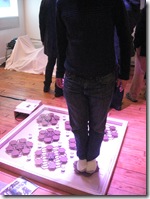
Participatory Design is worth revisiting, too. (pdf here). It revolves around giving the user a toolkit to design with alongside the investigative team, under guidance. Velcro, paper cutouts and stickers make it fun and easy. I think of these activities as design toys.

The three steps of PRIME – DREAM – CREATE are the guideposts for the process.

Priming is about getting users to think about their experiences, to talk and get into a flow. This gets the participants in the state to think or re-think their experiences. That’s the dream step. Once they are immersed in their dreams users can drift away from constraints and begin to think of their ideal experience. They may not know how to realize their vision – that’s finally up to the design team, to wrangle with trade-offs…but at this stage I want the user to focus only on the ideal situation. That ideal helps me define the top-level user experience that i want to capture in the product. That ideal is the one I fight for.

Oh…and don’t forget Testing! There’s an article from my old Design Research Professor on testing. (pdf here). On the subject of testing, I can only recall the words on another immortal Pratt professor who said “Mock it up before you fock it up.” (Thanks, Bruce!) What he’s trying to say is fail early and often, and get something in front of a set of users to get feedback. Iterations are ideal.

Oh…Ideals.

Mapping to Know

Spending a slow day at the office bursting my mind with knowledge…it’s fun.

It all started with a great LinkedIn Discussion on Research methods. This post is a “cream of the crop” memory device for me. The diagram above is from Liz Sanders of MakeTools out of Ohio. What I love about this is that it shows that user research is not just evaluative, but can be seen as truly generative of real ideas. In a recent conversation with a lead creative at another firm, he pushed back on design research, citing the old Henry Ford chestnut about faster horses. Humbug, I say!

I found the diagram below on Service Design Tools. They have a ton of awesome links and ideas.

TOUCHPOINTS_MATRIX_01

I like that this diagram is introduced first as a chart, then as a UX experience storyline. It’s like a chart-story. Wonky. Me like.


I enjoyed this diagram from this online design research guide. This would explain why my IxD peeps like to get down to business and verify later. I do a lot of “blue sky” projects, looking 5 years out. It’s fun, and you don’t have to user test your results. A group user session to gauge general acceptability is plenty.


And card sorting. Always fun and useful! The ever-popular IDEO deck is fun…but I found this cool Social Innovation Lab SILK Method Deck. Looking forward to unpacking it.

And then there’s always the IDSA research section with some goodies about mode mapping and pattern mining….


More later?

CMYK Event at Droog: Tasty

CMYK

On the 28th, Tasteologie, the test kitchen of Fork and Design put together CMYK Cocktail at Droog. It was a deeply, deeply enjoyable evening. It’s so rare to focus so cleanly and clearly on your senses…and what’s more, to decide if the green-colored cocktail you’re drinking tastes Blue, as the mixologist intended it to (it didn’t…sorry…it was very green tasting!). Tobias Wong’s clear cocktail that slowly turned red as the teabag infused the vodka and soda was a real revelation. It was a super-pleasurable meditation on color and taste.

The Image above is from the photobooth at the event where they tried to get us all to spell CMYK with our faces. Oh…and we all got dressed up in our favorite CMYK clothes. Good times.  The presentations were amazing and the whole event left me looking forward to the next taste experience from this team.

Back to the Futurists…or “we don’t need any roads”

IMG_1829 

So my education continues. A few weeks back I took a well-deserved trip to the Florida Keys to go kayaking with a 1 day layover in Miami. While my travelling companion hung out with her family in the area, I hit the Wolfsonian, the one not-to-be-missed design destination in the area.

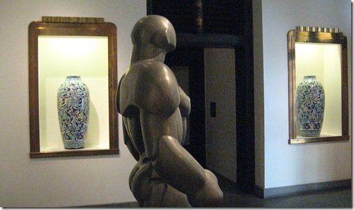
The whole museum is awesome, a wonderful collage of great design objects placed in great context.  You can see above the wonderful contrast between the Deco bronze window frames (from a department store in Buffalo in the 30s), the Italian urns from 1910 and this amazing sculpture from the 1932 Olympic Games in LA by Talcott. And that’s just the entryway.

IMG_1952-1The Italian Futurist section really blew me away…earlier in the museum the immense impact of modern technological change on the modern creative psyche was discussed. Never before had the world – so large and complex, more complex than ever before, begun to collapse into a hum of simultaneity. The telegraph, the airplane, the train…the beginnings of modern humans as a networked brain began then. You could know what was happening around the world almost immediately.

It was that Immediacy that Renato Di Bosso is trying to show in the Aeropainting self-portrait above: Speed, motion, multiple angles and the effort to synthesize an entire experience in a moment. the 1929 Manifesto of Air Painting asserts “the painter can only observe by participating in…speed”. Oddly enough I had the pleasure of meeting a futurist expert the following week…she doesn’t have the AirPainting manifesto on her site…but she has everything else futurist here, if you hunger for more manifestos. And who doesn’t? They are all so definitive and ballsy. To wit:

“With our enthusiastic adherence to Futurism, we will…Totally invalidate all kinds of imitation.”

IMG_1945-1I loved this sculpture by Bertelli from 1933 which is a Portrait of Mussolini. It brings speed, mechanism and dynamism to the idea of the human image. It’s kinda breathtaking.

It really made me think…the world is SO much more collapsed into a near singularity now than ever before…but is anyone trying to express this sense of overwhelmingness? I keep talking to people about  technology in my work and I hear kids in their 20s say that they are turning off facebook, or ignoring twitter…They need a break. There needs to be an artistic response to our modern experience to help us with integration. Maybe we need another futurist manifesto?

The Territory is not the Map: Personas and Storytelling

Thanks to @whitneyhess I went off to learn about Ad-Hoc personas in an ad-hoc way – by listening to 3 (free) minutes of a webinar coming up from Tamara Adlin.

What impressed me most about her pitch was that we ALL have personas or mental models of our users already. And, as Socrates exhorts us, the unexamined persona is not worth having.

Personas can help us guide our products, choose pathways in development, and as Liz Bacon helped me see at #ixd10, we can use these personas to build out detailed scenarios of usage. Personas and scenarios can guide us from strategy through to development, depending on how detailed we want to go. From establishing a shared language and model to building requirements and affordances.

I just presented some of these ideas to my team (who weren’t as lucky to go to Interaction10!) and what I heard was some frustration…Do we have to get bogged down in terminology, language and process? Can we just design?  

When I do a Google search of “California” I get lots of images. Emotional impressions, Vistas, Maps and Shapes.

When we design or tell the story of the design, the real challenge is always jumping from this overarching, thematic view (the “big picture") down to the emotional qualities of the product or service. Maybe.

Some Designers just want to design. I like to think about the themes and the big picture to make sure we all know where we are on the map and where we’re going. Both are important.

What I got out of today is that my team is not homogenous. Some of us have more tolerance for context and themes. Some of us are wary and want to limit the “time wasted” on this aspect and get to real solutions first. And we all have varying mental models of what sorts of people we are designing for. Finding this balance INTERNALLY is going to be a challenge, let alone with the client!

I don’t know how to do this…but with my team, we manage to hammer it out eventually.

IXD10: OMGWTF?! or…I need to process a lot.

Ok. I got back from Savannah Sunday night and have been reeling since then. Obviously, I have to work, too. This is a stopgap post! I need to put more into this.

Saturday night, out to dinner before the big Microsoft party, my mind was a blurry haze of ideas.

Jon Kolko’s image of a lot of DATA turning into (less) INFORMATION through synthesis was definitely where I was. I wasn’t yet at the INFORMATION to KNOWLEDGE moment. And far away from WISDOM.

But the next morning (after a night dancing at the Rockabilly mecca Jinx!) I went to Cindy Chastains’s talk on Storytelling and it ALL clicked for me.

Mike Kruzeniski’s talk on Polemics was really inspirational. he talked about framing dimensions of a project’s experience as mission critical, not through dry P0, P1, P2 priority language, but by characterizing aspects of the system as the SOUL of the system, not to be touched or ruffled. Other features were the heart and the body. The body could be trimmed by engineering, the heart could be altered…but the Soul was inviolate. And this language was adopted by engineering and helped keep the essential intent of the project intact.

Liz Danzico’s talk on Improv touched on FRAMES…in which a set of rules (like a chosen musical scale) allows for play and improvisational interaction. (See my favorite book, Finite and Infinite Games and Steve Portigal’s talk last year here and here (that’s me in the front row!) for more improv goodness).

Mike, Liz and Cindy were all saying the same thing…we can frame debates and guide inquiry through language and creative collaboration. Creating a frame is like setting the ground rules for the game.

Mike said “we aren’t going to talk your language any more. It doesn’t serve us. The game has a soul now, and we want you to respect it!”

Cindy had so much great material in her talk about how to use storytelling techniques to build interfaces that respond to people’s natural ways of hearing, but also how to “chunk” up a complex interaction into recognizable parts to be better analyzed.

Language is really our most powerful tool.

The Impossible Will happen

impossible So I watched this TED talk by Kevin Kelly and it is somewhat mind-blowing. The big take home for me is this: The impossible has happened, over and over again.

have you seen the Princess Bride?


“inconceivable!”

“you keep using that word. I do not think it means what you think it means.”

The Web is apparently as complex as a human brain right now. And in another 5,000 days (the current age of the Web) it will be as powerful as 6 billion brains. So, basically, as powerful as all of us.

Watch the talk. Enjoy. Expect the impossible!

ITP 2009

All in all, ITP is always fun, sometimes underwhelming. The best pieces are little jokes or games. One of the nicest was just a tent with a video projection on the surface of a campfire and woods. A bunch of us sat inside and just felt like we were backyard camping. It was a nice refuge.


IMG_1088 This was fun…The Face Fight Machine was a fun, collaborative drawing tool… You and a partner draw your faces simultaneously, using two styli that are linked…you move together. I liked that the only button clears the screen and prints your result at the same time.


IMG_1091 This was just plain creepy. But a cool use of a pico projector. The face, a looping video of some random expressions, follows you around using camera tracking.

IMG_1094 This was just upsetting…red, bloody drops where there’s been genocide or terrorism. The ink is stored in an IV bag. Nice.


IMG_1096 Delta was a fun concept, but a bit ham-handed and over-the top on the symbolism. There are two cameras that show you yourself from two angles.


 IMG_1097 IMG_1105IMG_1104

This one was fun…best use of laser-cutting and masonite in show, I think. More here.


IMG_1106 This wins best (and only) use of a barrel in show. Fun to ride. True story.

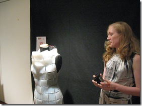
My last stop was the Life Dress. Elizabeth Fuller kept me occupied until the end of show with her seriously-siliconed-out dress, filled with LEDs and wires, ready to flash whatever. She’s planning a 2.0 version with more tiles.

IMG_1109

Flat-Packed digital Interaction

So much digital interaction…thanks to @kicker for the Android Tablet heads up… Watch the video of Jimmy Fallon being annoyed with the nook’s “sliver” of a touchscreen and play with an Android Tablet.

Here’s the thing…is long battery life so important to the user that they will put up with e-ink’s lackluster interaction capabilities? Nook tries to mitigate the issue and points the way to an interesting hybrid. This device, the eDGe takes it all the way.

The videos below (the first, from Bonnier, is very nicely done) show a rich and fluid interaction that is impossible to attain on e-ink. There are tricks and “stunts” that can be used to make e-ink look more fluid, but full, glossy color is out of reach for e-ink, as well as fast refresh times that users expect. I can’t seem to get Vimeo to embed…so just click the link!

I am curious to see what ecological niche e-ink screens occupy in the evolving digital lifestyle on the horizon. Smartbooks might be expensive for a time, e-readers might come down in price. Netbooks…oh, who knows? Anyway…enjoy.

Mag+ from Bonnier on Vimeo.

Wireframing Fidelity and Activation Energy

Enjoyed this discussion on LinkedIn. I’ve checked out Balsamiq and Axure and OmniGraffle. OmniGraffle wins for best name, for sure…but I’m no Mac user, sadly.

The discussion ranged widely, and the issue I think is FIDELITY. We talk a lot about fidelity of mockups in ID, and wireframes are prototypes. And that’s why paper sketching seems to be a good starting point for me and a lot of other people. I get that there’s the issue of workflow – if it’s going to be digital, start digital. but there’s also the issue of Energy of Activation – for me and a lot of others, picking up a pen is a lot faster (and portable) than sitting down on a computer. Low Fidelity, but high speed and low activation energy.